Advertisement
Dutch Designer Mirjam de Bruijn Makes Eco-Friendly Products ‘Attractive’
Advertisement - Continue reading below

Let’s talk about water. We all need it to survive. Apparently, our household products need it, too.
Virtually all of the household products on the market share one thing. Whether it’s an organic, eco-friendly brand or a budget buy, the main ingredient is likely just good ol’ fashioned water — 80 perecent water, to be more precise.
So what’s the big deal? Think for a second about how many products are shipped around the world — from manufacturer to retailer to you. Now think about the fuel and resources necessary to make that transportation possible. (Fast Company reported that shipping accounts for 90 percent of all global transport of goods, and up to 4 percent of total emissions.)
Get the picture? Well, Dutch designer Mirjam de Bruijn certainly did.
“I noticed how much many products in the supermarket decreased in size while they kept the same amount of doses,” de Bruijn told Standard News. “So I wondered how that was possible and went into the supermarkets to check labels, and all labels started with water … meaning that water was the main ingredient.”
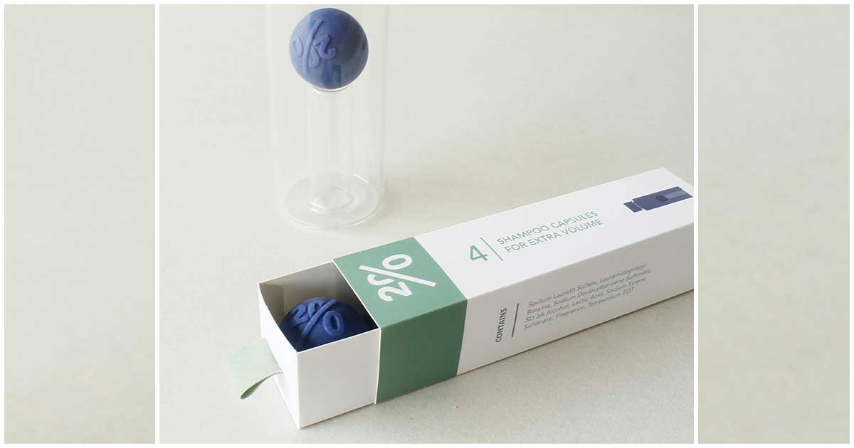
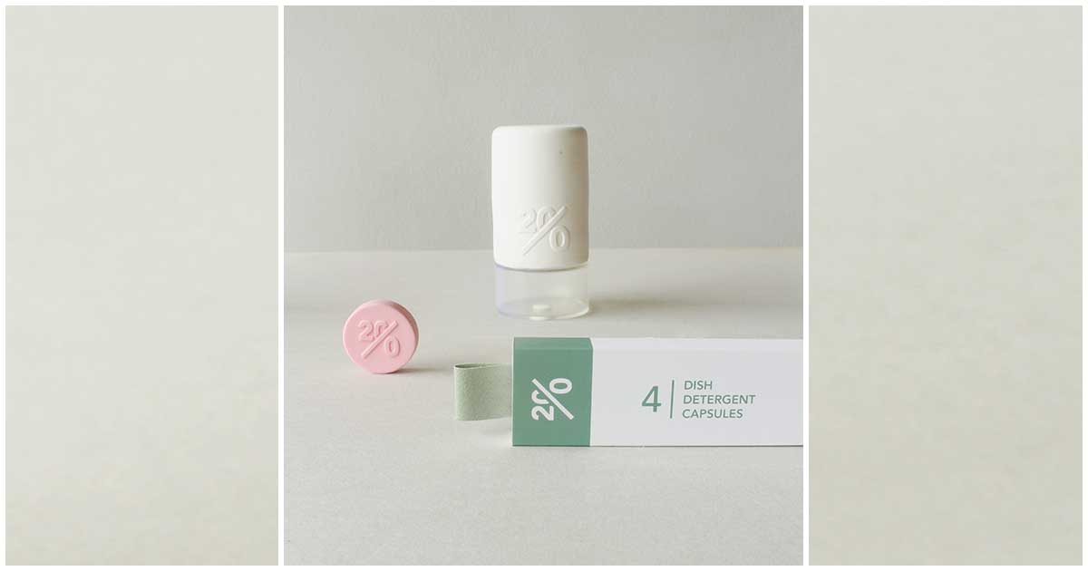
With a desire to scale back both the use and shipping of water in mind, she created Twenty, which features products distilled down into granules, tablets, or liquid capsules — sans water. Using specially designed bottles, consumers add their own water to the products once they buy them.
“There is a huge problem in this world, which will have a big impact on our future if we don’t do anything. I believe that by means of a good design, you can attract attention and make consumers aware of their behavior and offer them a good alternative,” she said. “So my first step is raising attention, and from there I’ll see what happens. My aim is that capsules become a standard for household products.”
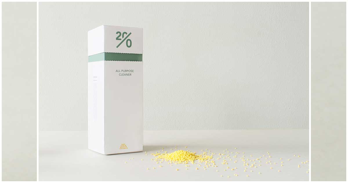
Currently, Twenty includes multi-purpose cleaning detergent, dish soap, and shampoo, each with a unique package design to optimize form and function. Take the shampoo, for example.
“For the shampoo, I had to bear in mind that it was a liquid capsule, which would explode,” she said. “And because of mixing it with the water, it’s best if it explodes in the middle of the bottle. Which is why the bottle has a small pedestal in the middle.”
Though she is interested in sustainability and minimizing the industry’s carbon footprint, de Bruijn is a designer at heart.
“I believe that design has the ability to make solutions attractive. There are already some companies that sell highly concentrated products, but they don’t look attractive or are unhandy to use,” she said. “With every new product/concept, you need early adaptors, and they should see your product and think, ‘Hey, that looks cool. I’m gonna try it!’
“For the design of Twenty, I wanted to make eco-friendly attractive. I also had to take in mind that the bottles that you buy are for multiple uses, so they would be much more designed than your ordinary packaging. You would need to be able to look at the bottles over and over again, and they needed to fit their environment.”
Twenty was the subject of de Bruijn’s thesis for the Design Academy Eindhoven in the Netherlands. She has since graduated and is trying to spread the word about the project, without much regard to patents and profits.
“I share the solution that I have because I believe that when you can have such an impact on our environment, you should aim for as much result as possible instead of protecting it with patents and not getting any result. That is why, at the moment, I’m trying to attract as much attention as possible. Consumers that I speak to often get very indignant at the fact that they’re buying bottles filled with water. And I hope that the result of this indignation will give (soap) companies the trust that there is a demand for a product like Twenty,” she said.
For more information about Twenty, check out de Bruijn’s video below or visit her website.
(H/T Fast Company)
Advertisement - Continue reading below

